Monday, August 24, 2009

Broke my leg..

It was supposed to be a two day trip to mumbai that became 7 weeks of bed rest. Last to last weekend I visited my brother in mumbai, went to lonavala on Sunday along with my bhai n bhabhi. At bhushi dam I slipped on a big rock, at first I laughed and nothing seemed wrong till I tried to get up, but then I realized that I cant move my right leg. Everytime I tried moving my leg, or someone helped me move it, I felt something moving in my upper thigh, there was a little swelling too. Anyway, I got up while 2-3 people held me with my arms. I was not able to put my leg down because of pain. Somehow I was made to sit on a chair and 6 people picked the chair to get me to the main road where I was seated in an auto rikshaw that took me to the hospital. The doctor at the hospital looked at my right leg which was about an inch shorter than my left leg and declared that I have fractured my leg. Now the question was where and how severe it was. He suggested two X-Rays: one for thigh and other for pelvis. Finally we found that I broke my Femur where it connects to Pelvis. The doctor suggested to take me to a mumbai hospital where I can be taken good care of as the fracture looked really bad. Then came Ramdas, a wardboy in the hospital who very carefully straightend my leg and tied it to a frame this reduced the pain to a large extent and it was now easier to move from bed to stretcher and then to a car that brought me to Vashi's MGM hospital.

Next day I was operated and the doctor said that the fracture was bad but the operation was successful. I was in hospital for a week and then I was discharged on the Independence day :) with a recommendation of 6 weeks bedrest before I can put weight on my right leg and try walking without supports. Today I'll see my doctor again, my stitches are to be removed. Apart from the pain and bed rest, the better side of the whole incidence is:
o my whole family is together at my brother's place
o all I have to do is eat, sleep, watch TV!!!

[edit] I don't know if anyone of those will ever read this post, but i really want to thank those guys who helped me to get to the auto rikshaw, without them i really would have been in a big trouble.

Sunday, July 26, 2009

Photo to vector art

After a long time... another tutorial!
Converting a photo into vector art. Using this method you can quickly and easily change a photo into vector art. Following is the final result of this tutorial:
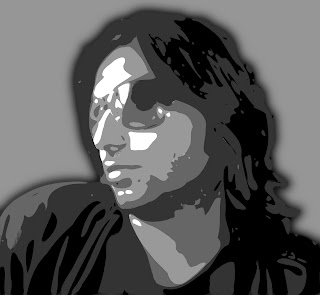


1] Open the image in GIMP. I wanted to have just myself in the final result, so used scissor select tool to crop myself out from the photograph
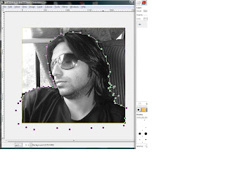
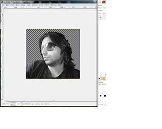


2] Use Filter | Blur | Gaussian Blur tool 2-3 times to smoothen the image.

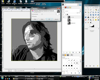
3] Now use Colors | Posterize tool to reduce the number of colors. I used 5 colors, you can use less or more. After you apply the changes, the image looks very much like the final result, but its still not a vector image!


4] Next thing we'll do is creating paths from these different colors. Use the 'Select by color' tool to select all regions with black color in the image.
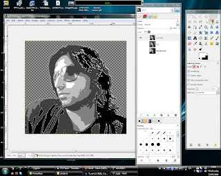


5] If you see closely, at many places there are very thin selections made which we probably don't want in the final image. We need to clear those selections before we proceed. Click on the 'Quick mask' button in the bottom-left of the image window. Use the Filter | Blur | Gaussian blur tool, to blur the quick mask. Blurring would cause very thin transparent regions in the quick mask to be filled.
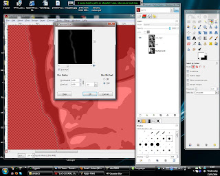


6] The blurring causes very thin transparent regions to be filled, but they are still not completely filled. Use Colors | threshold tool. Apply a threshold value such that the small regions are now filled.
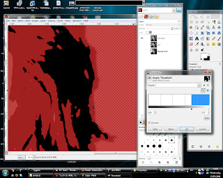


7] Click again on the quick mask button to get back to normal mode. You should see that most of the thin selections are removed. If there still are some regions that you want to deselect, you can do it manually. Because of the previous step, the size of selection is slightly reduced. Use Select | Grow tool to grow the selection by few pixels so that the selection is slightly bigger than the original black color region.
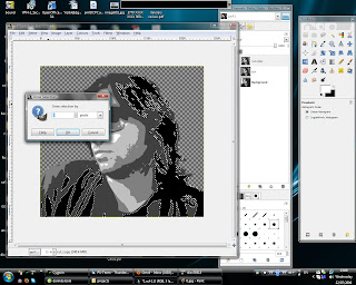


8] Select | To path tool will create a path using the selection, i.e. a path representing whole black region. Rename the path to '1'.
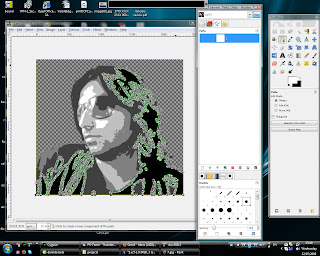


9] Do the same steps to create paths for all five colors, and rename the paths to 1,2,3,4,5.

10] The paths created are very complex and have a many nymber of nodes. We need to simplify these paths. Open the paths dialog, right click on each of the path and export them as .svg files.

11] Now open one of these .svg files in Inkscape and double click on the path [an object in inkscape] and press ctrl+L, this would simplify the path and reduce the number of nodes. Save the .svg file.
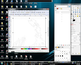
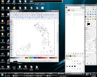

12] Do the same thing for other .svg files.

13] Rename the existing paths in GIMP or delete them and import the modified paths from the .svg files. To import right click in the paths window and click import.
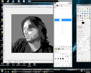


14] Double click on a path, this would show the path and select the paths tool in the toolbox. Click the select from path button to get a selection, create a new layer and fill the selection with some color. Similarly create a layer for all paths and fill them with different colors. I used the same 5 colors that the posterize tool used.
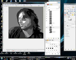


[15] Done! You can play around with other things, like I added a gray background and a shadow.

Sunday, July 12, 2009

Death

"Death smiles at us all, all a man can do is smile back"

I am not sure if you are a movie freak(neither am I as much as it sounds) but what I realized is, every time I watch a good movie again, I see new things or I'd rather say I feel a new things. Last night I watched Gladiator 'again'. This time what caught my attention was death. I am not really afraid of dying because I know for sure one day I 'will' die, but what bothers me is will I be able to smile back at my death. I know that I am not ready right now. Recently I had two road accidents (believe or not but both of them were not my mistake, I am not a reckless driver :) ). Truly speaking, I felt nothing 'during' the accident, but the moment I picked myself up, I was thinking what if this was more severe and I was killed, and I wasn't smiling at the whole incident. Lucky guy I am, nothing happened to me except some minor scratches(touchwood), but what I am thinking now is will I be able to smile at my death when (whenever and however it comes) I'll face it?

Tuesday, May 5, 2009

Enhance colors using HSV components


Following tutorial shows how to enhance colors of a photograph.
There are several ways to enhance colors of a photograph. Two of the methods are really simple and just require a few clicks. I'll be focusing mainly on the third method that uses the HSV components.

Following are the two test images that I'll be using:


First method - using GIMP's inbuilt color enhance option
GIMP has an inbuilt option to enhance colors[ Colors | Auto | Color Enhance]. Sometimes this option is just enough to do the job but sometimes the output is not very satisfying, moreover it doesn't gives you any control over how much enhancement you need.

Following are the two images after applying GIMP's inbuilt color enhancement:


As you can see, the first image looks much better, there seems to be more scope of color enhancement in the second image.


Second Method - Color saturation
The second method is also pretty simple. We can increase the color saturation in the image to get the desired result. Open the Hue-Saturation dialog [Colors | Hue-Saturation ]. Make sure primary color is selected as "Master". Now increase the saturation using the slider to enhance the colors. You can also play with the lightness to get the desired result.

Following are the results that I got after applying this method on the original images

For this one I used a saturation value of 80, and lightness value of 5

For this one I used a saturation value of 50


Third method - Using HSV components
This method gives us a little more control over how the saturation and the lightness is changed and with some trial and error it can give us much better results. If you don't know what is HSV color model, you must read a little about it.

1] First thing to do is to decompose the image into its HSV components. To do this select [ Colors | Components | Decompose ]. Chose the HSV color model, and check the "decompose as layers" checkbox. Click "ok".

2] You should get another image with 3 layers representing the H(ue), S(aturation), V(alue) components of the original image.

3] We'll be working only on the "saturation" and the "value" layers.

4] First, the saturation layer. You can use the levels or curves to enhance the saturation layer. To see the effect of the change you made, select [ Colors | Components | Recompose ], this would recompose the image using these layers.

I used levels to change the saturation layer. Following is the screenshot of it:


This is what I got after recomposing the image:


5] Now, the value layer. This layer represents the intensity of the colors in the image. I used the levels to enhance this layer. Following are the settings I used:


This is what I got after recomposing the image:


Similarly, I applied the same steps as above on the second image. Following are the screenshots of the intermediate steps and the final result:


Tuesday, April 28, 2009

Man is an animal

"Man is an animal", did I miss something? Oh yes! "social". "Man is a social animal", I remember reading that somewhere when I was in school. It sounded alright back then, but now, something seems wrong now or am I wrong now? I guess the more appropriate thing would be to say "Man is an anti-social animal".

To me it seems man created this whole concept of society just to cater to his anti-social nature. How can man remain anti-social when there is no society? Man setups all these rules for society and then just goes ahead and bashes them. What's the purpose of society? The purpose of society is supposed to be people coming together to support each other and make a better living. What really is happening in the name of society? People coming together to get benefit at the cost of others. They don't want to be better than others, they just want to prove that they are better than others. They'll look for things to ridicule other people, show them down, prove their own superiority. They love to criticize other countries, other religions, other castes, other societies, as if they are the chosen ones bestowed upon with all the superiority.

I think it would have been better if man was just an animal rather than a social animal.

p.s. Gupta ji, in the comment of last post you said "The day you will see a pig and human as equal, you will be a happy person". May be pigs are happier than men, probably they see us no different from them. :D

Monday, April 13, 2009

The more we learn the lesser we know

"The more we learn the lesser we know", sounds preposterous, but is it?
All the time I see the learned people struggling every day to learn more, to do more, to get more, behaving as if they got nothing, no time to take a time off, while the unlearned ones keep on enjoying their ignorance. The more we learn seems to take away much more from us. Everytime we learn something it opens up doors to many other things that we don't know and make us desperate for knowing more. The question is learning might be making us desperate to know more, but how does it cause to know less?

Lets say, knowing something gets you a positive point, and not knowing something gives you a negative point, the things that you don't know about (not even that you don't know it) gets you a zero. You might ask, whats the basis for this scheme? Well, I chose this scheme because I assume absolute knowledge is bliss, because when you know everything, you don't have to worry or fear, think or do anything about anything and your mind and soul are at peace, so knowing something gets you a positive point, a maximum score indicates bliss. As I see in my daily life, being aware of something that you don't know causes some negative effect that takes you away from this bliss, so a negative point for it, While not knowing about something (not even that you don't know it) just doesn't causes any effect, so a zero.

When a child is born he is at zero level, he knows nothing about anything. As he learns some new thing [getting a positive point for it :)], he learns about many more things that he doesnt know [and thus getting a negative point for each of them :(], the net result is: he moves to a negative level. As this *learning* continues he collects some positive points and many more negative points thereby continuously moving towards negative side, away from bliss.

Knowledge is boundless (and so, bliss is impossible, but a high positive score may be close to bliss), so a state never comes when a person is already aware of everything he doesn't know so that he can fetch no more negatives and then just continue moving towards bliss learning about everything he doesn't know. Everytime we learn something new, this boundlessness of knowledge just keeps us moving away from bliss or the absolute knowledge, and so "The more we learn the lesser we know".


[This post is dedicated to the highest positive scorer: Gupta ji]

Thursday, April 2, 2009

Put yourself on banner

Couldn't find a good photograph of mine to use (I am not photogenic), so I used Daniel Craig :D. This tutorial shows how to put a photograph on a hoarding. Nothing complex, just a simple thing. It just came across my mind, so I thought to write a tutorial.

GIMP version - 2.6.4
Image size - hoarding (1024x768), Casino royale poster(799x403)

Here are the two images that I started with


..this is what I ended up with


Following is what I did:
1] Open up the hoarding image in GIMP. Now, before doing anything else we need to make sure that the image that we are going to put on the hoarding is in (almost) same aspect ratio as the hoarding. To get the aspect ratio of the hoarding use the 'Measure Tool' to get the height and width of the hoarding, as shown below:


For the images I used the aspect ratio came out 2:1 which almost same as the image, so I didn't have to crop the image. If the ratio is different, make sure you crop the image before putting it on the hoarding.

2] Open the second image as layer. I'll call this layer as "poster layer". To put the image on the hoarding, use the 'Perspective Tool'. Reduce the poster layer opacity and in the perspective options select 'Preview' as 'Outline', this is not necessary to do, but it will help.


3] This is what I got after applying the perspective transformation.


4] Now, we need to do some clean-up stuff. As you can see the corners of the hoarding are round, there are few cables infront of the hoarding, a light at the bottom. Add a layer mask to the poster layer. Reduce the layer opacity so that we can see the hoarding border through it. Select the layer mask and paint black color over the area that we don't want to be visible. You can zoom in to do it neatly


5] This is what I got after rounding the corners:

6] Now, the cables: hide the poster layer, select path tool to create a path over the cables. Select the layer mask and "stroke path" with black color. I guess most of the cables in front of any such hoarding should be easy to handle.

Similarly, do the same thing for other cables. This is what I got:


7] Almost done, just the final touch. The colors in the poster look too bright compared to the surroundings. Reduce the brightness and contrast a little for the poster layer.

8] And then, here is the final result